 |  |
|---|---|
 |  |
 |  |
 |  |
ELLIPSIS MONTHLY RITUAL CLOTHS
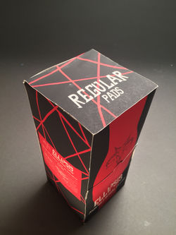
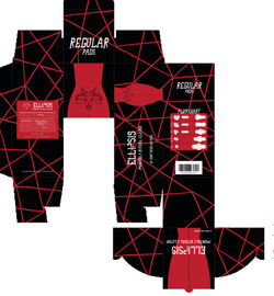
Sanitary pad packaging and advertisements typically focus on stereotypical aspects of femininity. This results in flowery pastel packaging and advertisements that try to promote the ease in wearing the product yet somehow ignoring the reality of a period for women (i.e. not wanting to do cartwheels in white yoga pants in a meadow). I went with a heavy metal period packaging approach to break the stereotypes. Furthermore, I chose the name Ellipsis because there are so many nicknames for periods that suggest it's a taboo or embarrassing subject. To quote the packaging, "There's no need for [not-pregnant] pause... It's not an ellipsis. It's your period."
Programs: Photoshop, Illustrator
Media: Digital Media, Printed Matboard
[Click photos to expand]